
My blogspot has has come to an end.
I have started a new blog thingy on Tumblr. If you want to stay up to date with my work and thoughts, you can find me here:
http://musarter.tumblr.com/
Thanks for coming here, looking, and a stand-up person.
Cheers-
Friday, May 8, 2015

Thursday, October 2, 2014
InkTober
In celebration of InkTober I drew something. Kind of a random super fast drawing just because. We supposed to do a drawing a day but I certainly wont go that far. That said, I hope to do a few more in the near future.

Rolling Tongue in the Rolling Hills
Friday, August 29, 2014
We Are All One (Process)

Here is a process gif of my newest illustration/design.
Step 1. You can see I started with a pencil drawing. I did some preliminary sketches of the layout and individual character studies before making this drawing. I tried to not use too many references because I wanted this to flow and be from my imagination. The drawing phase is the most crucial in my opinion because without a good foundation, or composition, the whole piece will fall apart. Once the drawing was finished I scanned it into my computer.
Step 2. I edited the drawing a little, changed the arm and leg length on one character, and then added a Layer Filter to give the drawing a pink tone while I inked the drawing.
Step 3 & 4. I inked the circle of characters and the text with black lines.
Step 5. Solid blue was added behind the circle of characters.
Step 6 & 7. The addition of low-lights (shadows) was handled next. Since the pencil drawing included shading I made the solid blue layer invisible while working on the shadows. The highlights where not part of the drawing and I made the blue layer visible while working on them. As opposed to what the gif (above) shows, I toggled back and forth between working on the low-lights and highlights. It is kind of a push and pull process, that reminds me of the process of addition and subtraction in sculpture, and it reveals itself as you jump from character to character.
Step 8, 9 & 10. The background color is added, the text color is changed to the highlight color, and some shade is added to the text.
Step 11. Not pictured. From the beginning each color was made in black, was created on a separate layer in PhotoShop, and had a layer color overlay as a color placeholder. After the art was finished I experimented with the highlight, mid-tone, and low-light until I was satisfied with the hue and vibrance in relation to the background. This phase is important and kind of a reflective period. From experience I know it should not be rushed; in the past I think I have ruined pieces in this phase by selecting bad colors.
There is a Psychedelic contest going on at Threadless right now and I decided to do something even though I have been a bit burned out lately. This time I drew something that was fun to draw and illustrated it in a screen-print friendly, or graphic, style. The style is influenced by skateboard deck designs I grew up with in the late 80s and 90s. Conceptually it based around the five senses and how they come together to form our consciousness. At the same time it is also about life, the afterlife, time and space. I am not sure if anyone will get any of that and it does not really matter to me. The conceptual side of art is what keeps me excited and motivated to keep making and finishing art. This all said, I want the meaning of this art to be fairly loose and up to interpretation. What I hope, in the end, is that people will think it looks cool enough to want to wear it but if they do not I am still satisfied because the process of making the art was fulfilling in and of itself.
Edited the text a bit. Here is the newest version:

I will post the link when to the design on Threadless when it is available.
Gifs

Recently I sat myself down and learned how to make basic animated gifs in PhotoShop. This is the result of my exploration. Hopefully you like it because I will start posting my newer gif creations now and again. Over time I hope to get better at them.
Wednesday, April 9, 2014
"T" Time
So there was this idea I had a long time ago. I originally planned for it to be a t-shirt design but I wanted to do the art in my preferred working style, which is not screen-print friendly. The concept of the design revolved around a tee, within a tee, within a tee but with a twist. I wanted to have some characters characters having tea time (drinking), while golfing (tee time), on a tee shirt. Then I thought about how this would be rather boring with people and brought animals into the process. Call it inspired, or WTF, but I thought about how it would be awesome to have whales playing golf. How could they do this? With mechanized exo-suits of course. What would they use for a club? Why not a giraffe. Since we are now in Africa, a pangolin would also make a nice ball. Plus the animal club and ball would be a bonus reference to Alice in Wonderland.

Once I had an idea and sketch put together I researched some whale, giraffe, and pangolin images, then drew the whole thing into a composition. Okay, fact-check reality is the drawing was so huge that the two whales on the left were on one sheet of paper and the whale on the right was on another sheet, and the composition came together in Photoshop.


I have not submitted the design. I was thinking it might work well in a drawing contest. I think I will get some feedback before I decide.
Thanks for looking and let me know what you think.
Here is the original sketch.
Once I had an idea and sketch put together I researched some whale, giraffe, and pangolin images, then drew the whole thing into a composition. Okay, fact-check reality is the drawing was so huge that the two whales on the left were on one sheet of paper and the whale on the right was on another sheet, and the composition came together in Photoshop.
Original composite drawing.
Detail of whales on the left.
Detail of Whale on the right.
After the drawing phase was complete, I set about finding textures that would work for all the different elements. For the whales, giraffes, and cephalopods, I referenced actual photos of the animals but altered the color and manipulated the shapes to fit within the drawing. I found other textures to fill in the nonorganic areas which were also color and shape manipulated. I then added shadows and highlights to all of the elements. Finally, I found and manipulated background elements to work in the composition.
The art at this point.
I removed the pencil lines here so you can see what
the texture/color looks like without the pencil work.
Color/texture Progress from pencil to completion.
At this point I was really happy with the results. The problem was that this would not print well on a t-shirt. The idea was scrapped, as far as shirts go, and the image was added to my portfolio.
On a whim, and mostly to see how it would score on Threadless, I submitted another design called "Speed is Relative" (see previous post) in this same non-print friendly style. It was my highest scoring design and it ended up printing months after it was submitted. They managed to print it beautifully.
For this reason, I started considering submitting "T time" for scoring. I had to make the design blend into the tee better so I used a nice Photoshop brush to round and fade the bottom on the composition a little. It also made the composition more vertical, and less square, and brought more emphasis to the characters.
Design to be submitted?
I have not submitted the design. I was thinking it might work well in a drawing contest. I think I will get some feedback before I decide.
Thanks for looking and let me know what you think.
Thursday, April 3, 2014
A Reprint at Threadless
I never said it here but I was printed again at Threadless. In fact, it did so well that it was just reprinted.


Here is the screenshot.
Here is an image of the art from the submission called "Speed is Relative." It was originally on Olive green but it was actually printed on a natural colored tee. I bought a coupe and the print looks really amazing for a t-shirt print.
Click on either picture for details.
For good measure, I thought I would post the original drawing of the design. I drew it in pencil first, scanned it into the computer, and added digital color/texture (wizardry) to it.
As always, thanks for looking.
Wednesday, September 11, 2013
Masks
When I was in college studying design I also created ceramic masks as another creative outlet. There is something primitive and freeing in forming something out of clay. I was also intrigued by the idea that cultures all over the world have created masks and that masks were frequently used in religious ceremonies.
Today, I still try to make a mask every so often. There is a local place that fires ceramics and has glazes artist can use. I go there when I have 2 to 3 hours to spare; With a full-time job, night school, and young children, this means pretty much never.
I am still intrigued by the idea of a mask. Hiding behind the face of another, or becoming someone you are not, is another interesting tangent to consider when making a mask. Can the wearer of the mask really separate themselves from that other person they are pretending to be or does it become another expression of the wearer's own identity buried within? Or maybe the power, or change, the mask wearer feels is from the reaction they get from other people who see the mask. The viewer of the mask will certainly have a different reaction to the mask wearer even if they know who the wearer is. You may think that changing one's visage does nothing to the psyche yet it is still an odd thing to consider why so many people, over time and all over the world, have used masks in some form or fashion.
These questions and thoughts were brought back into my mind when I went and picked-up my most recently fired mask. I have been so busy that it sat at the art studio for a month before I picked it up. In the old days I would pick-up my masks as soon as they were available. Times certainly have changed.


I plan to make more masks when time permits but it may be a year or two before I make one. In the meantime I just put my plethora of masks up in the attic to be unearthed when the right time presents itself.
Today, I still try to make a mask every so often. There is a local place that fires ceramics and has glazes artist can use. I go there when I have 2 to 3 hours to spare; With a full-time job, night school, and young children, this means pretty much never.
I am still intrigued by the idea of a mask. Hiding behind the face of another, or becoming someone you are not, is another interesting tangent to consider when making a mask. Can the wearer of the mask really separate themselves from that other person they are pretending to be or does it become another expression of the wearer's own identity buried within? Or maybe the power, or change, the mask wearer feels is from the reaction they get from other people who see the mask. The viewer of the mask will certainly have a different reaction to the mask wearer even if they know who the wearer is. You may think that changing one's visage does nothing to the psyche yet it is still an odd thing to consider why so many people, over time and all over the world, have used masks in some form or fashion.
These questions and thoughts were brought back into my mind when I went and picked-up my most recently fired mask. I have been so busy that it sat at the art studio for a month before I picked it up. In the old days I would pick-up my masks as soon as they were available. Times certainly have changed.

Most recent Mask

The first in my Mask series I created in College
I plan to make more masks when time permits but it may be a year or two before I make one. In the meantime I just put my plethora of masks up in the attic to be unearthed when the right time presents itself.
Tuesday, August 27, 2013
Old School
So, I have not posted in a long-time and I think it is high time I did. This is a new illustration for a challenge to do a design for the word "School." I wanted to do something with Old School but I was not sure which direction to use. I went with the concept of Old School Hip Hop Dinosaurs at the suggestion of a friend Tiffany Ambrose. Old School Hip Hop is really awesome and so are Dinosaurs, so how could I lose. The picture below is the final piece and the process follows.

Click on image to see bigger version.
First, I started with a basic sketch for composition and to get the idea on paper (below).

After finding some Hip Hop references (Ice T, Run DMC, LL Cool J) and Dinosaur images, I did a pencil drawing which then I scanned into the computer. Notice how I drew the background figures on a separate piece of paper. I did this because when I draw overlapping figures together I tend to get unintended line interactions that are hard to fix later in the process. In this case, I was also not sure whether I wanted to use a Stegosaurus or a Triceratops. Also notice the drawing is half only half inked in this image. I inked it with a wacom tablet using a 16 inch wide canvas at 400 dpi; I make it overly large so my lines will look better when the art is scaled to it's correct size.

I decided to go with Stegosaurus in the end. I really like the Triceratops by itself, but compositionally the Stegosaurus made more sense. Below is the fully inked art.

The next step was to add texture. Since this is limited color design (White, Red, Gold, Green and Black on Gray) I saved each color on a separate layer in PhotoShop. This was so I could easily adjust colors as needed. Below is a close-up of the final artwork.

It is scoring at Threadless.com, although I am not sure if it is printable. If you want support it please follow the link.
Thanks for looking.
Tuesday, June 4, 2013
War Pigs
If you have ever seen this blog before, you will know I have been submitting designs to Threadless.com for a while now. After all this time, and with much jubilation, a design of mine has been printed. It was a design titled War Pigs. The idea came from the song War Pigs by Black Sabbath and also derived from Orwell's Animal Farm. The anti-war overtones of the song and design are just as important today as they were in 1970, when Black Sabbath released the song.
I used public domain (creative commons) photos of Generals, and Leaders from WWII, and pigs. I combined them and matched the graininess of the newer photos with the old. I also tried to emulate an old time vignette to crop the bottom of the image.


I used public domain (creative commons) photos of Generals, and Leaders from WWII, and pigs. I combined them and matched the graininess of the newer photos with the old. I also tried to emulate an old time vignette to crop the bottom of the image.

This is the image from the original submission.

This is a screen shot from Threadless' home page.
Go and check it out if you get a chance. I am grateful for the community at Threadless and everyone else who has supported me thus far. Thank you for looking.
Wednesday, May 15, 2013
Children's Clothes Designs
It has been awhile but I am back with a set of Children's designs. It is for a contest sponsored by Wittlebee on Threadless. For all of these I did a literal, and cute, interpretation on commonly know themes.

The Cat's Pajamas.
Ideally this would be placed on a kid's pajama shirt
and the pajama pants would be a print of the fish pattern
I created for the design.

Click for details.

Turtle Neck.
Would be best on an actual turtleneck shirt.

Click for details.

The Sea Cow jumped over the Moon Jellyfish.
I was thinking this one would work well on a Onesie.
Thanks for stopping by and looking. Let me know what you think, if you feel so inclined. I will have the links for voting available once they are all approved.
Friday, April 19, 2013
Slow and Steady

15 x 11 inches, digital color and texture.
Click image to see larger version.
Here is a illustration I revamped, a while back, but never posted here. The previous version was blue and was titled "Slow Train" in reference to "The Blues." I felt the design lent itself to lazy hot summer days too so went with yellow tones for the second version. I also added texture, the smoke text, and framed in the background. If you want to compare this to the original here is a Link to the previous version.
Thanks for looking.
Wednesday, February 27, 2013
From Drawing to Digital Texture / Color
Here is a drawing I recently created of the ultimate dinosaur. My son has been a big fan of dinosaurs for a while now, so I decided to make a drawing of what I thought the coolest, most terrifying, dinosaur of all time would be. It's name is Tripterastegosaurus Rex and it is a combination of the dinosaurs Triceratops, Pteranodon, Stegosaurus, and Tyrannosaurus Rex. I researched and found references of the dinosaurs, mentioned in the list above, and birds of prey. I drew the picture using the numerous photo references and I imagined how the dinosaurs might be made into a hybrid. My son saw the drawing (below) and was delighted. From there I went about coloring and texturizing the original drawing.

The original drawing was monumental. It required two pieces of paper and four scans to create the composite. The final composite is 24 x 16 inches at 350 dpi.

At this point I found textures, from my favorite texture website, such as close-ups of lichen (skin), leaf veins (wings), stippled metal (plates), and ceramic glaze (horns). I used a rubber-stamp tool in PhotoShop to paint in areas with the texture I found. Once the textures were in place I adjusted the colors to fit the palette. Then, I added low-lights (shading) using a multiply layer, in PhotoShop, and high-lights using a overlay layer. Finally, I painted in some details that did not have any texture (tongue, beak, eyes).


The original drawing was monumental. It required two pieces of paper and four scans to create the composite. The final composite is 24 x 16 inches at 350 dpi.

At this point I found textures, from my favorite texture website, such as close-ups of lichen (skin), leaf veins (wings), stippled metal (plates), and ceramic glaze (horns). I used a rubber-stamp tool in PhotoShop to paint in areas with the texture I found. Once the textures were in place I adjusted the colors to fit the palette. Then, I added low-lights (shading) using a multiply layer, in PhotoShop, and high-lights using a overlay layer. Finally, I painted in some details that did not have any texture (tongue, beak, eyes).

Here is a detail of the final picture.
Click on each picture to see a bigger image.
Click on each picture to see a bigger image.
Tuesday, February 19, 2013
Drunk as a Monk

Abbey Ale is said to be some of the best beer in the world. Those Monks make beer and fine cheese's to support their monasteries. One has to imagine one of them gets loose every once in a while.
Tuesday, January 29, 2013
Cat Memes
If you have done any posting in blogs and / or Internet forums in last couple years you will have noticed the abundance of Cat Memes. Here is an image I created to embody some the most common cats I have seen and add some extra character to them. Since they are always used in the context of adding human attitudes or emotions I drew their bodies as humanoid. I am considering editing the text or nixing it completely.

15 x 11 inches Pencil and Digital Color / Texture.

Detail.
I also made this into a Greeting Card and added inside text that reads:
I gotz you some cats for your Birfday.
You can buy a print of this at Society6: Society6 Link
I also made this into a Greeting Card and added inside text that reads:
I gotz you some cats for your Birfday.
If you want to see this as a card or shirt please vote for it on Threadless: Threadless Link
Monday, January 14, 2013
National Champions

Here is a little design / illustration in of honor Alabama, College Footballs National Champions. It is called "Stomped" which adequately described what happened to Notre Dame in the Final.
Thursday, December 20, 2012
Recent Work
I did funny drawing that I later made into a more or less finished piece. The drawing plays on the word Mullet, as in the hair style (not the fish), and how it sounds like "mole" is part of the word.

I have also been sketching a kind of silly idea that is a mash-up between Chuck Norris and Charlie Brown. The idea is that Chuck is a nickname for Charlie and that Charlie Brown grew up to Chuck Norris; I think Lucy sent over the edge with her football shenanigans. I also added Nunchucks and Chuck Taylor shoes for good measure. The inked version is below:


I have also been sketching a kind of silly idea that is a mash-up between Chuck Norris and Charlie Brown. The idea is that Chuck is a nickname for Charlie and that Charlie Brown grew up to Chuck Norris; I think Lucy sent over the edge with her football shenanigans. I also added Nunchucks and Chuck Taylor shoes for good measure. The inked version is below:

First version edited after getting some critique: stance changed, more open shirt
with more chest hair added, and ripped sleeve added.

If I decide to move forward with it I will add color and what not.
 Here is the colored version. I changed the chest hair, once again. I also
used a half-tone technique to give it an old Sunday Comic Strip feel.

used a half-tone technique to give it an old Sunday Comic Strip feel.
Tuesday, December 4, 2012
Can I do it in time?
I have opted to try and create a design for a t-shirt contest for the band Arcade Fire. I had an idea for it, based on something I head said in an Arcade Fire interview, and sketched something about a week ago.

Then I started drawing it. I scanned the image in pieces then put them together into a composite.
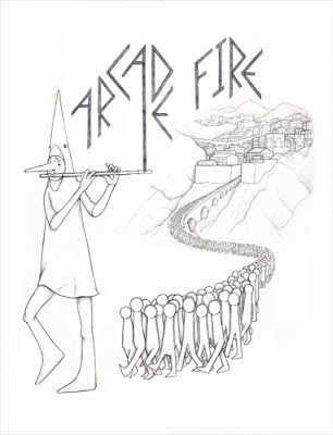
Now I have this together, can I color it and finish it by 12:00 EST? The answer is yes. I submitted with time to spare at 11:15. Here is the final colored version:


First Sketch
Then I started drawing it. I scanned the image in pieces then put them together into a composite.

Composite Drawing
Now I have this together, can I color it and finish it by 12:00 EST? The answer is yes. I submitted with time to spare at 11:15. Here is the final colored version:


Wednesday, November 21, 2012
Recycle Bin Design

I recently came across a design contest to design a recycle bin for Global Inheritance. Global Inheritance is a non-profit that oversees educational and environmental programs at major festivals and events across North America, and the Coachella Music Festival have created TRASHed.
It is always fun and challenging to design for a unique shape or surface. When I saw the shape and the hinge I knew exactly what I wanted to do. Whenever I saw a recycle bin open in the past, I always thought is kind of looked like a Crocodile or Amphibian opening a large mouth. I was lucky that Sculptee comes in a green that was very close to the plastic on the small bin. I used some burlap, a key chain ring, and some grommets to make the sash. Originally I conceived making arms and hands but as I put the piece together the sash idea came to me. I think the sash works better than the arm idea: it adds some texture and extra visual interest.

Here is my creation, "I am a Recycle-tarian," sitting on
my recycle bin at home.

Here is the "Recycle-tarian" with it's mouth open.
Thursday, October 25, 2012
Some Music for October
I just updated this Halloween / Monster Mix:
I also just created this Ghetto Mix. This mix makes me aware that things could always be worse and to be thankful for what I have.
I also just created this Ghetto Mix. This mix makes me aware that things could always be worse and to be thankful for what I have.
Wednesday, October 3, 2012
"T"eeny Meany & Miny Moe

Final version for Olive Green tee. I am also going to make a version for general print that will have less green and more texture.
Subscribe to:
Posts (Atom)


