Showing posts with label Josh Billings. Show all posts

Thursday, October 2, 2014

InkTober


In celebration of InkTober I drew something. Kind of a random super fast drawing just because. We supposed to do a drawing a day but I certainly wont go that far. That said, I hope to do a few more in the near future.


Rolling Tongue in the Rolling Hills

Friday, August 29, 2014

We Are All One (Process)


Here is a process gif of my newest illustration/design.

Step 1. You can see I started with a pencil drawing. I did some preliminary sketches of the layout and individual character studies before making this drawing. I tried to not use too many references because I wanted this to flow and be from my imagination. The drawing phase is the most crucial in my opinion because without a good foundation, or composition, the whole piece will fall apart. Once the drawing was finished I scanned it into my computer.

Step 2. I edited the drawing a little, changed the arm and leg length on one character, and then added a Layer Filter to give the drawing a pink tone while I inked the drawing.

Step 3 & 4. I inked the circle of characters and the text with black lines.

Step 5. Solid blue was added behind the circle of characters.

Step 6 & 7. The addition of low-lights (shadows) was handled next. Since the pencil drawing included shading I made the solid blue layer invisible while working on the shadows. The highlights where not part of the drawing and I made the blue layer visible while working on them. As opposed to what the gif (above) shows, I toggled back and forth between working on the low-lights and highlights. It is kind of a push and pull process, that reminds me of the process of addition and subtraction in sculpture, and it reveals itself as you jump from character to character.

Step 8, 9 & 10. The background color is added, the text color is changed to the highlight color, and some shade is added to the text.

Step 11. Not pictured. From the beginning each color was made in black, was created on a separate layer in PhotoShop, and had a layer color overlay as a color placeholder. After the art was finished I experimented with the highlight, mid-tone, and low-light until I was satisfied with the hue and vibrance in relation to the background. This phase is important and kind of a reflective period. From experience I know it should not be rushed; in the past I think I have ruined pieces in this phase by selecting bad colors.


There is a Psychedelic contest going on at Threadless right now and I decided to do something even though I have been a bit burned out lately. This time I drew something that was fun to draw and illustrated it in a screen-print friendly, or graphic, style. The style is influenced by skateboard deck designs I grew up with in the late 80s and 90s. Conceptually it based around the five senses and how they come together to form our consciousness. At the same time it is also about life, the afterlife, time and space. I am not sure if anyone will get any of that and it does not really matter to me. The conceptual side of art is what keeps me excited and motivated to keep making and finishing art. This all said, I want the meaning of this art to be fairly loose and up to interpretation. What I hope, in the end, is that people will think it looks cool enough to want to wear it but if they do not I am still satisfied because the process of making the art was fulfilling in and of itself.

Edited the text a bit. Here is the newest version:


I will post the link when to the design on Threadless when it is available.

Gifs


Recently I sat myself down and learned how to make basic animated gifs in PhotoShop. This is the result of my exploration. Hopefully you like it because I will start posting my newer gif creations now and again. Over time I hope to get better at them.

Wednesday, April 9, 2014

"T" Time

So there was this idea I had a long time ago. I originally planned for it to be a t-shirt design but I wanted to do the art in my preferred working style, which is not screen-print friendly. The concept of the design revolved around a tee, within a tee, within a tee but with a twist. I wanted to have some characters characters having tea time (drinking), while golfing (tee time), on a tee shirt. Then I thought about how this would be rather boring with people and brought animals into the process. Call it inspired, or WTF, but I thought about how it would be awesome to have whales playing golf. How could they do this? With mechanized exo-suits of course. What would they use for a club? Why not a giraffe. Since we are now in Africa, a pangolin would also make a nice ball. Plus the animal club and ball would be a bonus reference to Alice in Wonderland.

 Here is the original sketch.

Once I had an idea and sketch put together I researched some whale, giraffe, and pangolin images, then drew the whole thing into a composition. Okay, fact-check reality is the drawing was so huge that the two whales on the left were on one sheet of paper and the whale on the right was on another sheet, and the composition came together in Photoshop.

 Original composite drawing.

 Detail of whales on the left.

 Detail of Whale on the right.

After the drawing phase was complete, I set about finding textures that would work for all the different elements. For the whales, giraffes, and cephalopods, I referenced actual photos of the animals but altered the color and manipulated the shapes to fit within the drawing. I found other textures to fill in the nonorganic areas which were also color and shape manipulated. I then added shadows and highlights to all of the elements. Finally, I found and manipulated background elements to work in the composition.

 The art at this point.

I removed the pencil lines here so you can see what
the texture/color looks like without the pencil work.

Color/texture Progress from pencil to completion.

At this point I was really happy with the results. The problem was that this would not print well on a t-shirt. The idea was scrapped, as far as shirts go, and the image was added to my portfolio. 

On a whim, and mostly to see how it would score on Threadless, I submitted another design called "Speed is Relative" (see previous post) in this same non-print friendly style. It was my highest scoring design and it ended up printing months after it was submitted. They managed to print it beautifully. 

For this reason, I started considering submitting "T time" for scoring. I had to make the design blend into the tee better so I used a nice Photoshop brush to round and fade the bottom on the composition a little. It also made the composition more vertical, and less square, and brought more emphasis to the characters.

Design to be submitted?

I have not submitted the design. I was thinking it might work well in a drawing contest. I think I will get some feedback before I decide.

Thanks for looking and let me know what you think.

Thursday, April 3, 2014

A Reprint at Threadless

 I never said it here but I was printed again at Threadless. In fact, it did so well that it was just reprinted.


Here is the screenshot.


Here is an image of the art from the submission called "Speed is Relative." It was originally on Olive green but it was actually printed on a natural colored tee. I bought a coupe and the print looks really amazing for a t-shirt print.


Click on either picture for details.


For good measure, I thought I would post the original drawing of the design. I drew it in pencil first, scanned it into the computer, and added digital color/texture (wizardry) to it.


As always, thanks for looking.

Tuesday, January 29, 2013

Cat Memes

If you have done any posting in blogs and / or Internet forums in last couple years you will have noticed the abundance of Cat Memes. Here is an image I created to embody some the most common cats I have seen and add some extra character to them. Since they are always used in the context of adding human attitudes or emotions I drew their bodies as humanoid. I am considering editing the text or nixing it completely.

 15 x 11 inches Pencil and Digital Color / Texture.


Detail.

You can buy a print of this at Society6: Society6 Link


I also made this into a Greeting Card and added inside text that reads:
I gotz you some cats for your Birfday.

If you want to see this as a card or shirt please vote for it on Threadless: Threadless Link

Thursday, September 13, 2012

GAP "Clever" Contest Designs

I usually don't enter many design contests even though I should. Bucking up a bit, I decided to enter a Threadless challenge sponsored by GAP. I past they tended to print simple one or two color designs. So I did these two designs based on what has printed previously and the prompt "clever." If you have the time, view the links below and vote. Let me know what you think.

Bad News Bears - Threadless T-shirts, Nude No More

Link here too


  Sound Wave - Threadless T-shirts, Nude No More

Link here too

Friday, August 24, 2012

"T" Time: IF (Tall)

Click Image to see a little bigger
Finally, I am finished with the epic undertaking. See earlier post below to get an idea of how much I lagged on getting this together. When I do something for myself, and put the full effort forward, sometimes it takes a very long time.

Closer Detail

Friday, August 10, 2012

Keep On Keeping On

Update: 4/3/2014
I finished this a while back and I thought I would add the art here. It went in a little bit of a different direction than I it would. In the end, I was happy with the results. I hope it would make Crumb proud.

This one is available at my Society6 store (See sidebar)


Here is the original drawing.

A while back a friend of mine mentioned that she would love a reproduction of a classic retro t-shirt design that she loved that was called "Keep On Truckin'." I like the concept and feel but I felt the art could use some updating, and some of my style, to make it even more awesome. I like the idea of the character looking more care-free and more hippie-like. I haven't heard the phrase "truckin'" in a long time so I thought "keep on Keeping on" might sound better contemporarily speaking. The original "Truckin'" design is below.


I am not sure how many colors to make the design yet. I also might change the text style and even the actual phrase is something better comes up; I considered a the recent pop-culture phrase "Haters gonna hate." If you have any thoughts or ideas to add I would be much obliged.

Thanks for looking.

Thursday, June 28, 2012

Dah-vid (Post-post Modern Art)

14.5 x 7 inches or 10 x 22 inches. Pencil converted to digital color


Here is an illustration I did to show the silliness of internet culture. A bit of a jab at what is visually popular, what people actually look at, and what is considered art these days. It begs the question "What is art?" Did that sound pretentious enough?

Friday, June 22, 2012

ChaDes Challenge LXV: Highlanders

This is my return to the ChaDes Challenge set forth by honorable Austin Madison. I have been absent from the challenge for too long. In anticipation of the movie Brave, challengers are creating Highlandish character designs. This is Crannog Mackinnon the highest of the Highlanders from the Isle of Sky; please excuse the bad pun.


I have another illustration / design based on an older ChaDes Challenge that I did not participate in, but loved, that I will post soon. Keep yar eyes peeled.


Wednesday, May 16, 2012

Finished "Reading Opens Doors"


 I recently got a printed copy of the "Reading Opens Doors" flip-book I completed a while back. It turned out great. If you refer back to my previous post, you can see there were some changes in the cover illustration which I think were for the better.

Click for detail
  

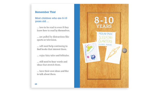
 Here are a couple more examples of the layout inside the book. As I mentioned before, each chapter had a door with art that represented the age group discussed in the chapter. Every example below is pulled from a different chapter to show how each chapter has a different color code. I also wanted to post an image that showed the page icons and general layout.

Click for detail

Click for detail

I know it has been a while since there has been a new post here. I have neglected this blog but I plan to post new work weekly in the future. To be able to post weekly I am going to start posting more Graphic Design work. If you have any objections please let me know.

Friday, January 6, 2012

Reading Opens Doors

This is a recent project I have been working on in collaboration with my Literacyhead.com partner. We were contracted to create a 5.5inch x 3.25inch educational flip-book for Smart Start Education, a division of The United Way of Metropolitan Atlanta. The flip-book would be given to parents to help the parents encourage reading through games and activities described in the flip-book. The project is not finalized and we are still working on some client requested edits. Pictured above is the cover we presented to the Smart Start Panel.

The image above is the first draft of the cover. Initially, we decided to make the front cover be a door that opens into the content of the book. The challenge was to make a door interesting and inviting. We thought using a child would be engaging and also established that showing the child's thoughts, of what doors could be opened through reading, would work well conceptually.

After the initial draft was approved, I redrew the image to be used in the color draft (pictured above).

Next I added the color, texture, and the children's thought images. From here we came to the conclusion that the kid's face needed to be cuter and more family friendly. I was also asked to include a pot of flowers to add some visual interest. The draft with these changes is the final draft image at the top of this post.

While I was working on the cover, I was simultaneously working on the book layout. Each chapter was appropriate for a specific age group. We thought it would be cool to make each chapter be a different door that is being opened. Each chapter door has drawings, or elements, that relate the to the age group represented in the chapter. Pictured above is a chapter introduction spread for the 4-6 Years chapter.

Pictured above is a spread of how most of the pages look in the flip-book. Each chapter uses a different color scheme to let the reader know which section they are in. Everything that is red, in this example above, changes to a different solid color with each advancing chapter. The pages are 5.5inches x 3.25inches, the font size is 11 point, and it will be spiral bound.

This is the Back Cover. We wanted to have visual interest/friendliness and invite the readers to use the flip-book again.

Wednesday, December 7, 2011

Recent Art


I have not posted for awhile and for that I apologize. I recently committed to remaking a design by an artist on Threadless. I respect the artist Isaboa (Joe) and I thought his design had some potential. Here is my version.


Below is Joe's original design. I took his concept, added my style, and subdued the color. I also kept the dynamic composition.


I was late submitting a design for an Indian Pale Ale design for Finch's Beer Company. It was an open competition and I drew this picture the day it was due. Needless to say it was not going to get finished for the competition.


I also had the opportunity to create a design for the band Clap Your Hands Say Yeah. Most of their merchandise was pretty strange looking hand drawn art and I tried to push the envelope in that direction. I was going for bazaar but drawn well; I really liked my final product. They ended up going with designs that were more solid graphically speaking.

Monday, November 7, 2011

Literacy Head: Comparison 2 (Somehing Different)

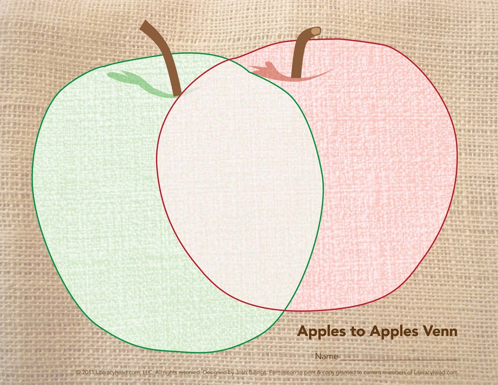
Here is a couple samples from the most recent Literacyhead issue. They are in the "Tools-You- Can-Use" section and are a continuation of the Comparison tools (or Venns). This time around I used burlap and fabric as inspiration. Actually Mollie, my wife, has been making art in this style recently and I sampled her style for this series. Below are my favorite finished pieces.


Monday, October 17, 2011

College Designs (Threadless)

I am posting some designs I did for a Threadless Challenge to redesign 12 college mascots. I only got around to 2 but I like how they turned out.

I have always been bothered by the commonly seen Georgia Bulldog mascot I see around town in Athens, GA. I wanted to make a cool and aggressive bulldog to contrast the poorly drawn goblin-looking mascot. I used actual bulldog images, the idea of a full-bodied mascot (which many other colleges embrace), a ready to pounce football player, and the Rancor creature (from Star Wars) as inspiration for my design.

Georgia Design Link


For Auburn I strove to use the concept of their established logo/mascot and take it to the next level. Their logo is circular and I used angles to create more aggression. I also used more of the tigers face to further intensify that aggression. For this design I used actual Tiger images, super hero emblems, an almost symmetrical triangle (and the space it creates), and the current Auburn logo/mascot for my inspiration.

Auburn Design Link

Tuesday, August 30, 2011

Fun in the Sun

This is an illustration that shows that Humans have a place among color changing animals. Everyone knows that chameleons can change color with mood or environmental influences, but not everyone knows that frogs, cephalopods, and sea horses also change color; most usually have a brown phase and a bright phase. I also wanted to show a group that enjoys the beach in different ways. I have the process listed below.

First is a rough sketch. I wanted to figure out the order of the animals and how they would fit together in a composition. I also started some loose character design.

Next I drew the line work with pencil. Then I redrew each character, on separate layers in PhotoShop, with my Wacom tablet. I did this so I could easily alter or switch each characters position.

Next I finished some line work and added texture. I framed everything with a oval vignette to give it an old time feel. I also made the texture and line one color so it could be screen-printed. My intention, if this went onto a t-shirt, is that the color would be UV ink that would be invisible indoors but bright and vibrant outdoors. Hence the title, Fun in the Sun. This image (above) is how it would look indoors and the top image is how it would look outside.

On a side note, the chameleon has the Hemingway book The Sun Also Rises. Also I submitted this design as part of a Threadless challenge called "Threadwars," and I was not aloud to promote it on my blog until the round was over. I am happy to report this was my highest scoring submission on Threadless to date.


Fun in the Sun - <span class=