Wednesday, December 7, 2011

Recent Art


I have not posted for awhile and for that I apologize. I recently committed to remaking a design by an artist on Threadless. I respect the artist Isaboa (Joe) and I thought his design had some potential. Here is my version.


Below is Joe's original design. I took his concept, added my style, and subdued the color. I also kept the dynamic composition.


I was late submitting a design for an Indian Pale Ale design for Finch's Beer Company. It was an open competition and I drew this picture the day it was due. Needless to say it was not going to get finished for the competition.


I also had the opportunity to create a design for the band Clap Your Hands Say Yeah. Most of their merchandise was pretty strange looking hand drawn art and I tried to push the envelope in that direction. I was going for bazaar but drawn well; I really liked my final product. They ended up going with designs that were more solid graphically speaking.

Monday, November 7, 2011

Literacy Head: Comparison 2 (Somehing Different)

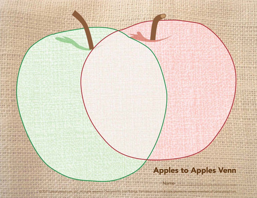
Here is a couple samples from the most recent Literacyhead issue. They are in the "Tools-You- Can-Use" section and are a continuation of the Comparison tools (or Venns). This time around I used burlap and fabric as inspiration. Actually Mollie, my wife, has been making art in this style recently and I sampled her style for this series. Below are my favorite finished pieces.


Tuesday, October 25, 2011

Kids Tee


Or Goat Tee. I had this odd idea of making a shirt that was a play on words or Double meaning. The Goat Tee is a shirt for a goat with a goat on it. And each successive goat would be wearing the shirt; so there would be a shirt within a shirt within a shirt, etc.


On my blog here I want to describe he process of the execution of this design. First I new I wanted a decent photo of a goat. When I was at a petting-zoo with my kids I took some photos of small goats from multiple angles. I found this front angle to work best in the end. I had to do some photo editing to contrast and make the lit-up area on the right-side of the next have lighting consistent with the rest of the goat.


Next I had my son pose in a couple different ways so I could use the best pose for the design. I stuck with this pose that looks like he is showing of the design of his shirt. The hardest part of using photo was erasing (or rubber-stamping) the actual shirt's design off of the shirt.


Once both photos were prepped I combined them and maticulously erased the background of the final result. Once this was compete, before I flattened the image, I made solid underlays of the shirt and the rest of the body so I could change the shirt color and the rest of the body color.


Then I flattened the color version, skewed it to look right on the odd shirt angle, and the duplicated and shrank the image over and over again to get the shirt within a shirt affect. See top version for final color test.

I also made single color versions and tested them on multiple shirt colors.


Placement:

Friday, October 21, 2011

IF: Fuel

Fossil Fuel's Revenge: 16 x 10 (Click to see detail)

I am glad the prompt for Illustration Friday was "Fuel." I have been messing with this art for a while and the prompt got me off my duff to finish it. I had to shrink it to make it look good online, hence the more obvious bitmapping. It is great to do something for IF again; it had been too long.

Monday, October 17, 2011

College Designs (Threadless)

I am posting some designs I did for a Threadless Challenge to redesign 12 college mascots. I only got around to 2 but I like how they turned out.

I have always been bothered by the commonly seen Georgia Bulldog mascot I see around town in Athens, GA. I wanted to make a cool and aggressive bulldog to contrast the poorly drawn goblin-looking mascot. I used actual bulldog images, the idea of a full-bodied mascot (which many other colleges embrace), a ready to pounce football player, and the Rancor creature (from Star Wars) as inspiration for my design.

Georgia Design Link


For Auburn I strove to use the concept of their established logo/mascot and take it to the next level. Their logo is circular and I used angles to create more aggression. I also used more of the tigers face to further intensify that aggression. For this design I used actual Tiger images, super hero emblems, an almost symmetrical triangle (and the space it creates), and the current Auburn logo/mascot for my inspiration.

Auburn Design Link

Tuesday, September 20, 2011

Literacy Head: Comparison

The newest addition to Literacyhead.com is a lesson on comparing. We decided to make Venn Diagrams so kids could find similarities and difference between objects; mostly animals. Pictured below are pages where kids could compare a T-Rex and a Dragon, a Frog and a Toad, a Dolphin and a Shark, & a Pizza and a Pie. I had to abstract the figures a little, in most cases, to make the Venn's more usable (see example of Shark and Dolphin for most obvious stretch. Overall I am pretty happy with the way they turned out.


I have an exciting illustration project that is coming up that I will show you soon. The entire project is due by October 1st, so wish me luck in it's timely, stress free, completion.