These are all intended for web viewing and are pencil sketches with digital texture / color.
All images ©2012 Literacyhead, LLC.

 |
| Click for detail |
 |
| Click for detail |
 This is a recent project I have been working on in collaboration with my Literacyhead.com partner. We were contracted to create a 5.5inch x 3.25inch educational flip-book for Smart Start Education, a division of The United Way of Metropolitan Atlanta. The flip-book would be given to parents to help the parents encourage reading through games and activities described in the flip-book. The project is not finalized and we are still working on some client requested edits. Pictured above is the cover we presented to the Smart Start Panel.
 The image above is the first draft of the cover. Initially, we decided to make the front cover be a door that opens into the content of the book. The challenge was to make a door interesting and inviting. We thought using a child would be engaging and also established that showing the child's thoughts, of what doors could be opened through reading, would work well conceptually.
 After the initial draft was approved, I redrew the image to be used in the color draft (pictured above).
 Next I added the color, texture, and the children's thought images. From here we came to the conclusion that the kid's face needed to be cuter and more family friendly. I was also asked to include a pot of flowers to add some visual interest. The draft with these changes is the final draft image at the top of this post.
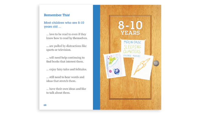
 While I was working on the cover, I was simultaneously working on the book layout. Each chapter was appropriate for a specific age group. We thought it would be cool to make each chapter be a different door that is being opened. Each chapter door has drawings, or elements, that relate the to the age group represented in the chapter. Pictured above is a chapter introduction spread for the 4-6 Years chapter.
 Pictured above is a spread of how most of the pages look in the flip-book. Each chapter uses a different color scheme to let the reader know which section they are in. Everything that is red, in this example above, changes to a different solid color with each advancing chapter. The pages are 5.5inches x 3.25inches, the font size is 11 point, and it will be spiral bound.
 This is the Back Cover. We wanted to have visual interest/friendliness and invite the readers to use the flip-book again.