Showing posts with label design. Show all posts

Wednesday, May 16, 2012

Finished "Reading Opens Doors"


 I recently got a printed copy of the "Reading Opens Doors" flip-book I completed a while back. It turned out great. If you refer back to my previous post, you can see there were some changes in the cover illustration which I think were for the better.

Click for detail
  

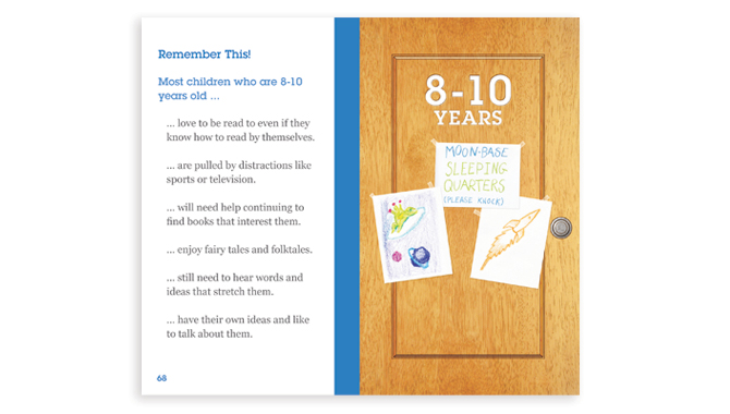
 Here are a couple more examples of the layout inside the book. As I mentioned before, each chapter had a door with art that represented the age group discussed in the chapter. Every example below is pulled from a different chapter to show how each chapter has a different color code. I also wanted to post an image that showed the page icons and general layout.

Click for detail

Click for detail

I know it has been a while since there has been a new post here. I have neglected this blog but I plan to post new work weekly in the future. To be able to post weekly I am going to start posting more Graphic Design work. If you have any objections please let me know.

Friday, January 6, 2012

Reading Opens Doors

This is a recent project I have been working on in collaboration with my Literacyhead.com partner. We were contracted to create a 5.5inch x 3.25inch educational flip-book for Smart Start Education, a division of The United Way of Metropolitan Atlanta. The flip-book would be given to parents to help the parents encourage reading through games and activities described in the flip-book. The project is not finalized and we are still working on some client requested edits. Pictured above is the cover we presented to the Smart Start Panel.

The image above is the first draft of the cover. Initially, we decided to make the front cover be a door that opens into the content of the book. The challenge was to make a door interesting and inviting. We thought using a child would be engaging and also established that showing the child's thoughts, of what doors could be opened through reading, would work well conceptually.

After the initial draft was approved, I redrew the image to be used in the color draft (pictured above).

Next I added the color, texture, and the children's thought images. From here we came to the conclusion that the kid's face needed to be cuter and more family friendly. I was also asked to include a pot of flowers to add some visual interest. The draft with these changes is the final draft image at the top of this post.

While I was working on the cover, I was simultaneously working on the book layout. Each chapter was appropriate for a specific age group. We thought it would be cool to make each chapter be a different door that is being opened. Each chapter door has drawings, or elements, that relate the to the age group represented in the chapter. Pictured above is a chapter introduction spread for the 4-6 Years chapter.

Pictured above is a spread of how most of the pages look in the flip-book. Each chapter uses a different color scheme to let the reader know which section they are in. Everything that is red, in this example above, changes to a different solid color with each advancing chapter. The pages are 5.5inches x 3.25inches, the font size is 11 point, and it will be spiral bound.

This is the Back Cover. We wanted to have visual interest/friendliness and invite the readers to use the flip-book again.

Wednesday, February 16, 2011

Tea/Tee Serpents (Process)

I recently completed some art for a challenge on Threadless called the Thermos Loves Design Challenge. I have always been intrigued by designs that wrap around cylinders, so I decided to take a stab it with the Tea/Tee Serpents design. I decided to make a design with no end. It does this fusing at a seem and wrapping around the cylinder.

I was inspired by pottery designs of ancient civilizations. The scale motifs were inspired by North-African art and the water swirls where inspired by Ancient Greek art. The idea of using a snake was influenced by the importance of snakes in the Ancient Mayan culture. I wanted to use the circle, of the Thermos, to represent infinity. As you may have guessed, each character represents the four-senses: Visual, Auditory, Smell, and Taste. The sense of touch is activated by touching the Thermos.

The design process is demonstrated below:

The red box shows the first sketch of the concept. The little faces represented possible faces for the serpents.

This a sketch demonstrated how the Thermos would look. This also shows the idea of using swirls for the liquid in the art.

I downloaded the measurements for the Thermos and created a template to follow to make sure the serpents fused seamlessly.

I drew each serpent and the swirls on separate sheets of paper. I used the previously mentioned template to place the serpents and swirls in the composition. I was also extremely careful to cut and place the fuse making serpent, and swirls, in the perfect position. I printed a copy and taped the paper together at the fuse location to be sure the serpent and the swirls lined up correctly.

Then I experimented with color and came up with a cool palette. I also inserted a water droplet texture behind the serpents; I had to use the rubber-stamp tool in Photoshop to make the droplets repeat exactly along the seem.

I put the placed the design in a t-shirt and Thermos template for the world to see.

It is a three-color print on a light blue shirt or a three-color blueish gray brushed steel Thermos.

Here is a link to it on Threadless, pending approval of course:

Tea/Tee Serpents - Threadless, Best T-shirts Ever

APPsolutely inGENIOUS!


Anyone who follows this blog probably remembers that I do work for an online magazine called Literacyhead. Last week I was contacted and asked to create 6 logos/identities in 24 hours; and yes, my jaw dropped with a deadline like that. It turned I actually had a weekend to complete the project for an education competition but that is still not a lot of time.

The identities were for a Suite of APPs called APPsolutely inGENIOUS! Each App uses art in different ways to teach story comprehension. The mix of Literacyhead being good about letting me be creative and clear communication, about the project, made these identities a success.


Art Starts uses art that relates to a particular story to help kids understand the story.


The Build App asks the readers to build a building, house, or room based on their level of comprehension of the story.


This one uses art to make analogies to help with reading comprehension.


Picture Problems uses Math to help with the comprehension of stories. Don't ask me how this works, I am terrible at math.


This App uses the different substance of cooked egg textures to demonstrate levels comprehension: Hard-boiled (understand clearly), Fried (kind of understand), and Scrambled (don't understand).

Saturday, April 24, 2010

More Threadless designs

Armpit Hare - Threadless T-shirts, Nude No More

Western Yin & Yang - Threadless T-shirts, Nude No More

I am going to post two more soon and try do a promotional blitz. Follow the links to see more details and t-shirt placement. Please let me know what you think and vote at Threadless if you get a chance.

Based on comments and interest, I decided to go with "Armpit Hare" rather than the "Ear Hare" from the previous post.

Wednesday, March 24, 2010

Threadless

Hmmm...what? - Threadless T-shirts, Nude No More

Turned-On - Threadless T-shirts, Nude No More

I have just started my attempt at designing shirts for Threadless.com. If you read this post, and you like the designs, please go to Threadless and vote for design and mark that you would buy it. There should links embedded above. If I get printed, not only will it boost my ego but I could receive substantial monetary compensation.

I will probably start posting more t-shirt designs intended for Threadless in the near future.

Tuesday, March 9, 2010

The Process

The Squid and The Whale. 12 x 12 inches Pen & Ink and Digital color/texture.

Here is a picture I created recently. The battle between a Giant Squid and a Sperm Whale is an intriguing concept. Here are two modern monsters, that actually exist, battling for supremacy in the shroud of our mysterious oceans. Besides just making an interesting image it begs many questions since it has never been documented. Who attacked who? Are there squids large enough to kill whales? Do they hunt each other?

I have been working on a lot of t-shirt designs lately and I was recently told I should do a design with "Nautical Stars." I wont pretend to be a Nautical buff but I do like monsters. I thought I could do a design I liked and incorporate the stars too. I went ahead and drew the squid and whale in mortal combat; pictured below.

I used multiple photo references for each creature to figure out their anatomy. I then used a circular composition by using the creatures poses, placement and foreshortening. I then inked the pencil drawing; pictured below.

Afterwords, I made a high-resolution scan. I cleaned up the drawing a little in Adobe PhotoShop CS4. I placed the image into Adobe Illustrator CS4 and used the Live trace tool to turn the art into vectors. I arranged some vector stars and paint spatters, I had on file, to create the background. I used "Nautical Stars" around the whale because whales seem to be a big part of nautical history. I used the spatters around the squid because squids ink. The result is the following picture; shown below.

Finally I took the image and tried it in black and reversed, as white, on different colored t-shirt templates. I was happiest with the white ink on a light blue t-shirt combination; pictured below.


I hope people like the final product and I also hope that all the hard work pays-off. I liked the concept so much that I went back and did a more artistic treatment of the original art; See the top picture.

Monday, September 14, 2009

Chades: Choose Your Own Drawing Adventure

The caption is as follows:

"Once there was a pink kitten who made a deal with the devil so he could avenge the death of his parents."

I was thinking of an anti-super hero in the vein of Spawn.

Visit Austin's site to see more Pink Kittens.

I was going to draw a background and a grand battle ensuing but low and behold times was again a factor to consider.

Monday, July 13, 2009

T-shirt ACC Stormwater

Stop standing there idle, help those animals express their frustration.

7/20/09 Update of original art to make all parties happy.


Here is a job I recently finished. It is for the Athens/Clarke County Stormwater department. They needed a t-shirt for their new hot-line. It was requested to illustrate the design to look like a graphic novel. This is my attempt. Tell me what you think.

This is a 5 color screen-print on a light blue t-shirt. I added an updated version July 17th so you can take a look at the half-tones.

Tuesday, April 7, 2009

Eric Clapton

Recently I was humbled to be to have the opportunity to designs a concert t-shirt for Eric Clapton. This kind of opportunity does not come up very often and frankly, I honored just be able to take part. Clapton is a music legend, and in my opinion, he is be admired for staying relevant and rocking for so many years.

I have been doing some freelance design for a screen-printing company for which I used to work full-time. Pretty much all the t-shirt designs seen on my blog are from work I have done for this company. When I got the call that we would be submitting designs to Clapton's management I was ecstatic. The only direction they gave was not use Clapton's face or an image of a guitar. So here is the best of what I came up with in a two day dead-line.

Sound Cloud: The concept was to combine psychedelic art with modern design.
Rasta Clapton: The idea here was to capitalize on one of Clapton's best known hits; his remake of the Bob Marley classic "I Shot the Sheriff."
Clapton Monument: He is so monumental in the history of rock that I thought it only fitting.

I am still waiting on what Clapton's people think. In the interim, please let me know your thoughts. The good, the bad, and the ugly.

Wednesday, March 25, 2009

IF Poise: T-shirt Submissions

In these recently created designs, and the designs from the previous two post, I have been trying to create compositions with a great degree of poise.

Poise from Webster's- 1: a stably balanced state : equilibrium poise between widely divergent impulses — F. R. Leavis>2 a: easy self-possessed assurance of manner : gracious tact in coping or handling.

"Odd Bird"

"Type-Writer"

"Super 80's"

"Tape Vomit"

"The End" based on the real ending of The Watchmen.

I have not been posting lately because I have been fervently working on some t-shirt designs. These, along with the previous two posts, are some of the submissions I have made to a start-up company called "Transmission." I am very excited about the prospects of this company.

Please let me know what you think about the designs: Would you were them? Which is your favorite? Do any of them rub you the wrong way? Do they have poise?

Tuesday, January 20, 2009

T-shirts design for January

I have not posted for a while and I am glad to say that I finally have something to show for it. I was recently commissioned by a previous employer to create some t-shirt designs for the band Widespread Panic. I was told to be influenced by Grateful Dead art. I was also told that we were going to try and use a printing technique were the ink is thin and washed out; hence the slightly faded colors in the designs. The following illustrations and designs are the best ideas that I came up with.


People who have previously been to my blog may recognize the last design. It was a design I did for Iron and Wine that was rejected. I thought it was strong, so I updated it and put Widespread's name in there.

I would be delighted to know which one is your favorite.

Monday, August 25, 2008

IF: Routine


Living in Athens, GA., it has become very routine to draw bulldogs. I have drawn bulldogs countless times and the only way I think I will escape this request is to move somewhere outside of Georgia. This project was fun because I also got to draw Jared, the Subway spokesperson.
I finished this one today, for a freelance client. T-shirt design, hence the limited color.

Thursday, August 16, 2007

So a rhino, a giraffe, and an elephant go into a bar...


I recently felt inclined to draw a rhino, a giraffe, and an elephant drinking coffee together. I could not explain why I needed to draw them, I just did. Then out of the blue I was requested to do some t-shirt designs for "Iron and Wine," who is a musician I like a lot. His promoter wanted a circus themed design and any other art. The gray shirt is my circus styled design and I got to use my RGE drawing for another design on a natural colored shirt. I thought they turned out pretty cool and I hope "Iron and Wine" thinks they are cool too.